Sunday 25 January 2009

(Typography: Good Typography Is Invisible? )


Is good typography really suppose to be invisible? I understand the point the poster is trying to show, Typography isn't suppose to be wham bam in your face but you got to attract attention to it and it also depends on the subject matter. For example something to do with new rave you can't really hide the type because of the big, bold, neon colours you associate with it and without out that style it wouldn't correspond with the subject matter.

So does good typography really have to be invisible or just blend with the subject matter?

(Typefaces: Part 1) Different Typefaces

I'm a bit hypercritical about this subject, At the moment my favorite friends are Helvetica and Century Gothic. I feel within my comfort zone while using them within my designs but I hate how much these typefaces are used in public design. There is no need to continuously use these over and over again. There are many other typefaces out there which look amazing and are free so theres no excuse. Whatever the purpose you need the typeface for there will be one out there for the job. I'm going to break out of my comfort box and use many new and different typefaces from now on and so should everyone else.

Heres some exciting typefaces I found just quickly browsing the net


(Inspiration: Part 4) Peter Saville

art


Peter Saville was a huge inspiration to me during college and still is now while I'm working on my designs. He has produced lots of interesting designs and artwork. He has produced CD covers and vinyl covers for a band called suede and joy devision. I think he is just a designer with a strong and own image. Even though his work varies throughout projects it is always clear that it was produced by him.

Saturday 24 January 2009

(Early Work: Transmission)


This is another piece of design which I produced while studying at College during 05/07. This project was to make up a brand and give it an identity. I picked "transmission", an urban street wear brand.
First I had to design a logo and then base the rest of the identity to go with the logo. We had to design; a point of sale display, a price tag, a logo and a bag. I used a photo in which I took previously in the course while studying the photographic side of the course and I felt it would go well with urban street wear feel of the brand. I kept the colour scheme simple by just using shades of red with white and the photograph fitted well with the colour scheme. I feel now that the typeface is not totally suitable for the purpose but when I produced this, it was pretty early on in the course and so there was lots of room from error and I have learnt from this mistake.

(Early Work: Transmission)


This is another piece of design which I produced while studying at College during 05/07.

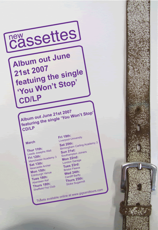
(Early Work: The New Cassettes)

This is a project which I produced while studying at Milton Keynes College studying a National Diploma in Graphic Design. The brief was to design; a poster, an a5 flier, a CD album, 2 CD singles, and a 7" and 12" vinyl album sleeve. The New Cassettes is a local band from Northampton. They are a indie band and a new album was due to be released shortly at the time. I took a personal approach and used a personal interest of mine which is belts. On each part of design there would be various belts which I got from myself, my fellow student and my tutors.


(Inspiration: Part 3) Pop Art

Even though I don't use pop art as inspiration within my publishing work, it's always in my mind while designing. Wether it's the colour schemes in which was used or the hard thick lines or maybe just the overall feel of the artwork. Since I was at school I have been interested in Pop art and the typical Pop Artists including Andy Warhol and Roy Litchenstein. However, in the last couple of years with further insight into the artists and their methods, I have become less interested in the art movement. Mainly because of most of the artist's having hardly involvement in the art piece in which they claim is their own artwork when actually there studio had more involvement than the actual artist did. For example Andy Warhol had hardly any involvement with his artworks and his studio " The Factory" produced a fair percentage of the finished artworks.

(Inspiration: Part 2) Random Typography


(Inspiration: Part 1) Big Active


Even though I class myself as a typography, I'm also very interested in all types of art forms. I take inspiration from all different areas of art and design including typographers, publishers, illustrators, designers, photographers, textiles etc. One of my favorite designers which is classed as an illustrator is Jasper Goodall. He is a illustrator thats works for a company called
Big Active. He has produced CD artwork for Muse and he produces a lot of self promotional work. Another Designer/Illustrator which I am interested in, is another designer working for Big Active called David Foldvari. Some of his pieces of work have a graffiti effect to them as they are not clean cut and has a rough effect to it. In both Jasper's and David's work they both use felt tip/marker approach where they would do an illustration and have the streaky pen mark in the coloured parts. I feel this makes there work more impacting as it gives it a hands on feel. However they both show they are capable of producing artwork from various mediums.


(Left) Jasper Goodall
(Below) David Foldvari